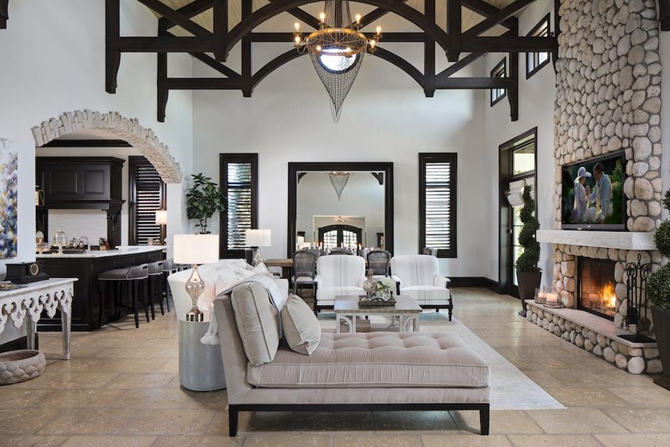
Is your living room this perfect?
NativeHouse Photography/Lisa Gilmore Design
When decorating your living room, it can be a challenge to get everything just right. After all, designing a space is really about balancing creativity and practicality, especially when there are so many choices. The problem is that it’s so easy to make the wrong choice. And no one can notice these mistakes more quickly than an interior designer.
Here are ten common mistakes interior designs always notice, as well as how to fix and prevent them in the first place.
Thinking A Sectional Is The Best Way To Make A Room Feel Cozy
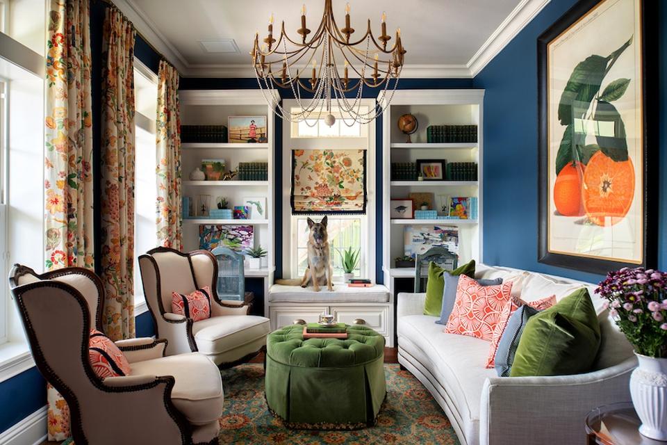
Interior designer Lisa Gilmore, of Lisa Gilmore Design, sees too many people automatically choosing a sectional because they just want their living rooms to feel cozy. “Do I love a sectional? Of course. However, there are usually so many ways to do a floorplan other than just with a sectional,” she says.
Cozy without a sectional
Lisa Gilmore Design
Gilmore recommends thinking outside of the box and forgoing l-shaped pieces. “Using independent chaises or daybeds in a space can add a nice addition of curves (or modern straight lines) to break up a space. Also, they are amazing floater pieces, so you can walk around them and often not interrupt a view.”
Installing Art Too High Over The Sofa
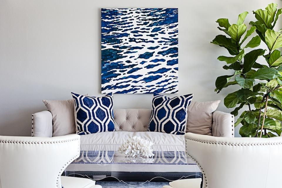
Another mistake Gilmore frequently sees is art hung too high. “And this isn’t just over the sofa honestly, it’s in general. We are all going to need to go to the chiropractor with some of the high angles we are forced to look at for art.”
MORE FOR YOU
You’re probably hanging art wrong
Lisa Gilmore
When hanging art over a sofa, whether it’s for a large piece or a gallery wall, the designer says art should never exceed ten inches from the back of the sofa. “Usually the sweet spot is eight inches. For art that’s not over a piece of furniture, the centerline of the art piece (or gallery wall) should be just above average eye level, usually around 65 inches from the floor or so.”
Installing A Television Over The Fireplace
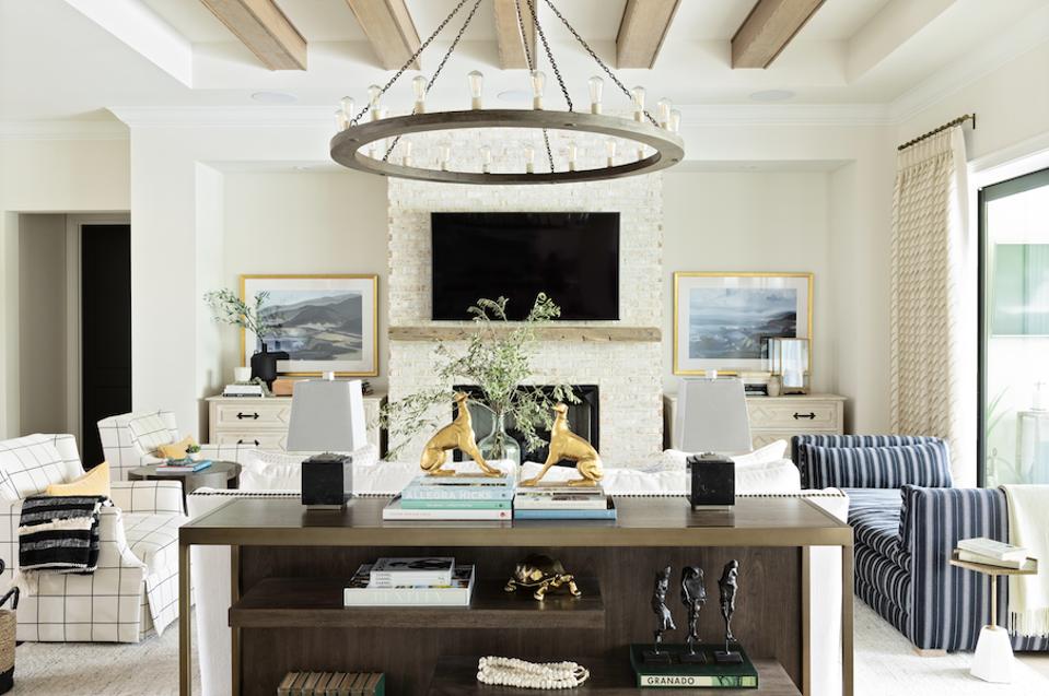
“Many times people feel like they have to put the television over the fireplace —as if that is the 100 percent intended spot for it. That is truly not always the case. However, sometimes it is the right answer,” says Gilmore. “Often, you can adjust the focal point of the room, or if you are really open to it, allowing the fireplace to become the perfect backdrop.”
Sometimes over the fireplace is the perfect spot. Other times, it isn’t.
Lisa Gilmore
“For this home, we adjusted the floorplan, for the television to be on the adjacent wall on a long credenza and allowed for the fireplace to create a large cozy backdrop, arranging furniture in front of it,” she says.
Using Recessed Ceiling Lights
Aurore Martial, interior designer and founder of Domus Venus, says that one of the biggest mistakes she sees people making is with lighting, recessed lighting in particular. “I’d keep recessed lighting only in the kitchen where you actually cook and in the bathroom (and in that case, try to have them with fittings in a color that matches the ceiling— the bottom line is to conceal them).”

This is a bad idea.
Photo by Dyana Wing So on Unsplash
Her rule of thumb is to use one main lighting source and then two or three mood lights.
Choosing The Wrong Size Furniture
“I often see small spaces crowded with high back furniture and large spaces that feel empty,” says Martial.
For small spaces, she recommends choosing compact furniture with narrow armrests. “Here, more than anywhere else, it’s important to have room around the furniture.
For rooms with low ceilings, “Opt for furniture with thin legs and a low backrest to give the impression of height and space,” she says.
For large rooms with high ceilings, Martial emphasizes the importance of going with pieces that really anchor the room, like a larger sofa and armchairs, to avoid the “empty dance floor feeling”, even if you prefer a more minimalist style.
Lack Of Texture
“It’s a lot more interesting to get a variety of textures, mixing cold (marble coffee table, mirrors, metal legs, and lights) and warm (velvet chair, wood flooring), smooth (silk cushions and taffeta curtains), and textured (bouclé fabric on armchairs, plants, trimming on curtains, etc), plain, geometric and figurative accessories or fabric too,” says Martial.
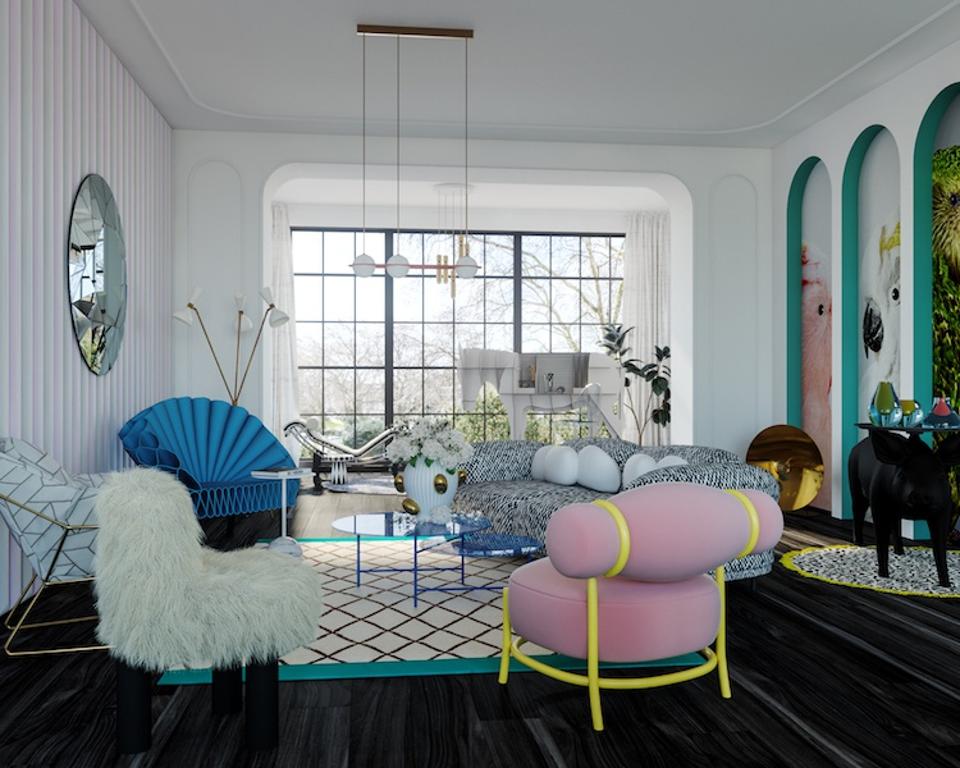
Texture is the key to style.
Domus Venus
She suggests staying within the same color palette for a more sophisticated look.
Ignoring The Importance Of Scale
According to Samantha Gallacher, co-founder of IG Workshop and founder of Art+Loom, the biggest mistake people make with living rooms always comes down to scale. “They either use a sofa that is too small, or they are afraid to properly fill the space. They may use a standard rug that doesn’t frame the living room,” she says.
What’s the solution? “Play up the size, not down. Frame out your seating area with a larger rug. You can try and create a full u-shape for conversation. This might mean a sofa and two chairs, with a third chair on the other side. It can mean a sectional, but then make sure you have other seating to balance out the L-portion of the sectional,” says Gallacher.
Choosing Too Many Pieces That Match
One of the biggest mistakes that Kevin Isbell of Kevin Isbell Interiors sees is using too many matching pieces. “The side tables match the cocktail table, or the sofa and the chairs all match. The eye needs to be constantly stimulated and enticed, so when all the elements in a room match it starts to feel static,” he explains.
To liven the space up, Isbell recommends using different side tables next to the sofa. “Just make certain that they are of a similar scale to one another,” says the interior designer.
If you have table lamps, he suggests choosing ones of the same height so the lampshades will align on either side of the sofa.
“As for matching chairs, find something you love in a fabric that works in the room and coordinates with the sofa, but isn’t a carbon copy. If you change nothing else, this alone will make a big difference. The room will then feel more thoughtful and acquired, and not as if you backed a truck up to your local big box store and loaded it up with the first suite of furniture you found,” he says.
Forgoing Window Treatments
Decorating your living room isn’t always necessarily about what you do, but also what you don’t do. Roxy Te Owens, founder and creative director of Society Social, notices people commonly overlooking window treatments. “Although they may not be the first element you think of when designing a living room (ie. sofa, lounge chairs, etc), window treatments play a pivotal role in the overall feel of a space,” she says.
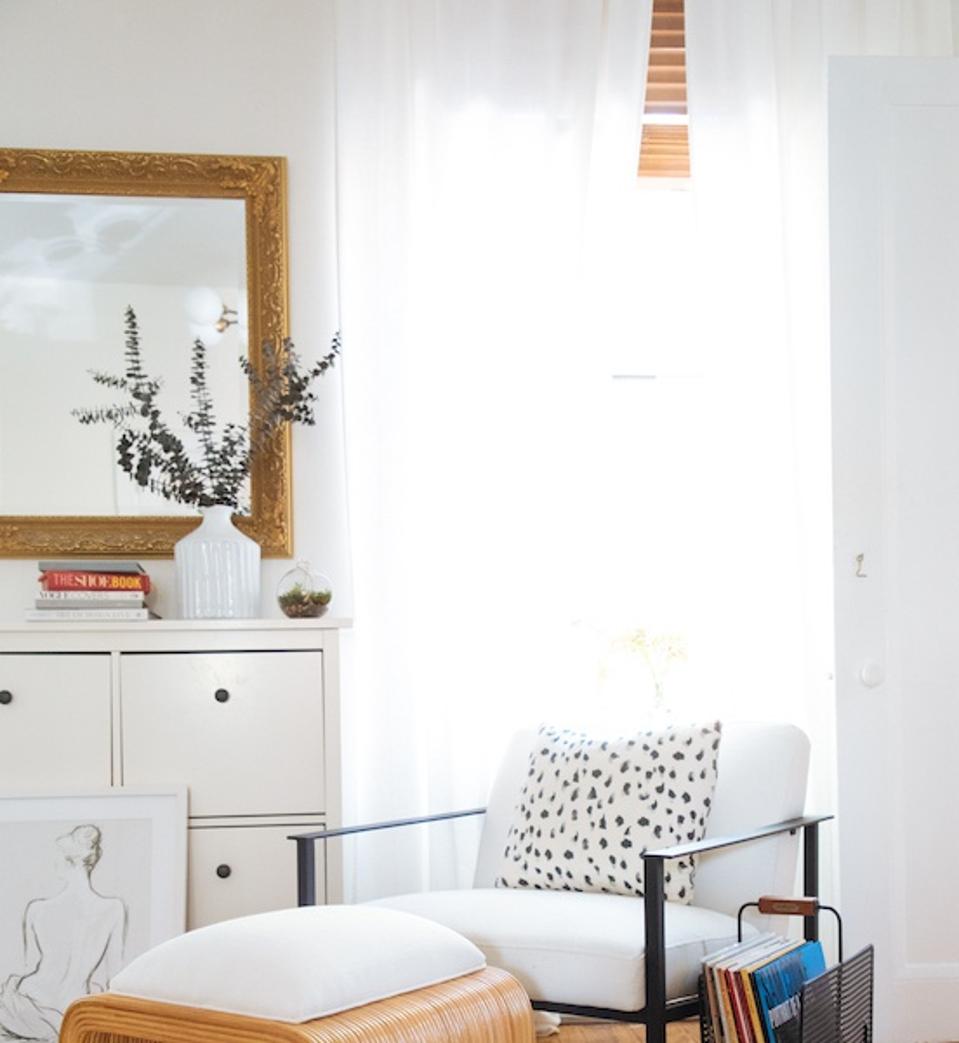
Don’t overlook window treatments
SocietySocial
“Not only are they functional, offering privacy and softening light, aesthetically speaking, window treatments beautifully frame and ground a space. In our opinion, a living room is not finished without a stunning window treatment, whether that be woven shades to incorporate natural texture, scalloped cornices, or show-stopping patterned drapery.”
Overlooking How A Space Is Used
One major mistake that interior designer Liz Caan notices, is that people don’t often think through how a space is used. “[For example], a surface for a drink within reaching distance from every seat or lamp tables, are non-existent.”
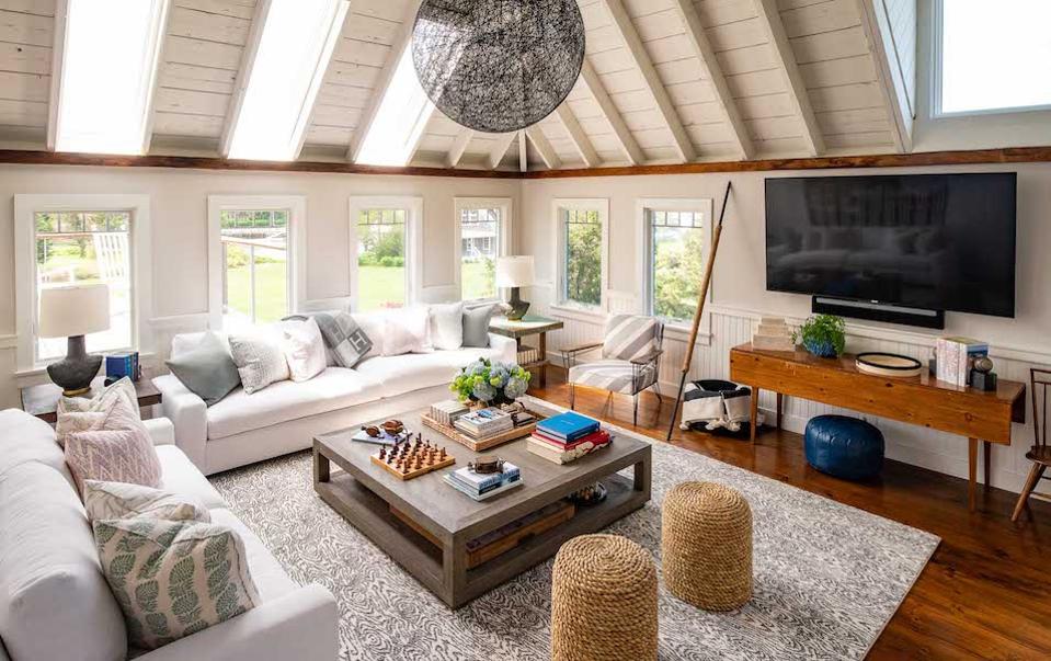
A perfectly designed living room by Liz Caan.
Liz Caan
So what’s the ideal way to remedy this? “The best way to furnish a living room is to identify the focal point(s), the traffic patterns and then try and be efficient with what you need to accomplish these goals. Allowing for more negative space in a room allows for traffic and energy to flow much better throughout the house,” says Caan.

I was really intrigued by the part of your article that mentioned how picking too many furniture pieces that match could be problematic and unadvisable. This is something I usually end up doing and is probably why my current house doesn’t look all that exciting to live in. I’ll see if I can find an interior design expert in the area that can advise me on how to properly decorate the place with better furniture.
https://www.suzannes-designs.com/