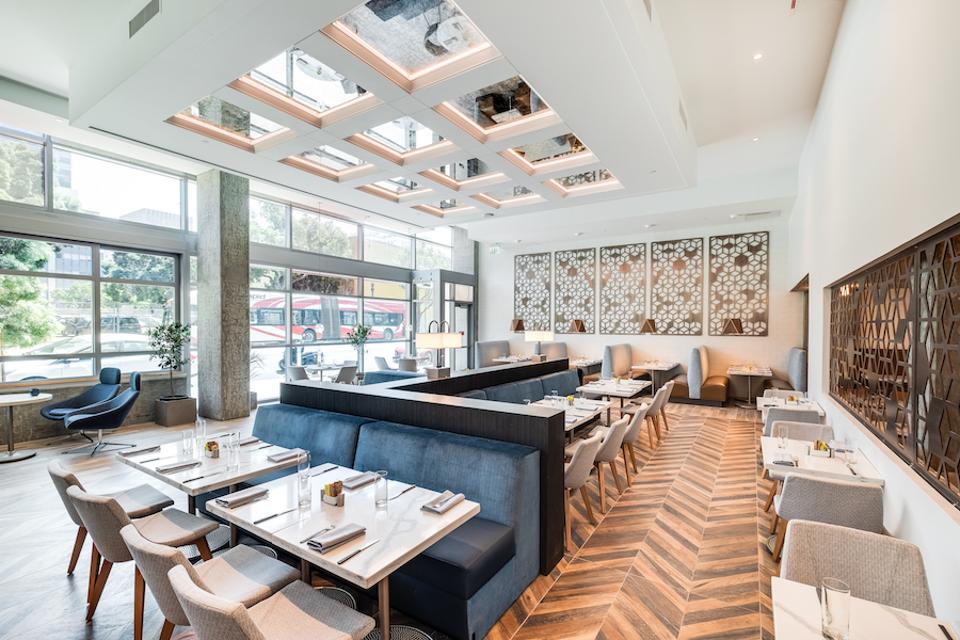
The Carte Hotel in Little Italy.
Haley Hill Photography
San Diego might be one of the most underrated cities in California. From great hotels, restaurants and gorgeous landscaping, it has an incredible amount to offer especially when it comes to interior design. From trendy new hotels to fine dining, shopping and wellness (is there anything more California than wellness?), this city has everything to see and do. Here are the spots interior design aficionados (and those who aspire to be) shouldn’t miss.
The Carte Hotel
Located in Little Italy, the Carte Hotel is just several months old. Part of Hilton’s Curio collection, it has the infrastructure of a major chain with the feeling of a chic boutique.
It also has lots of amenities including several dining options, a wine bar and more than 28,000 square feet of fitness and wellness space.
The design of the hotel was inspired by the neighborhood with a variety of unique features that combine the best of modern, contemporary and just a touch of mid century modern elements. The property was designed to celebrate the nautical heritage and architecture of the locale. One example of this is the abstract metal screens resembling fishing nets throughout the first level, which pay homage to Little Italy’s heritage as a fishing village.
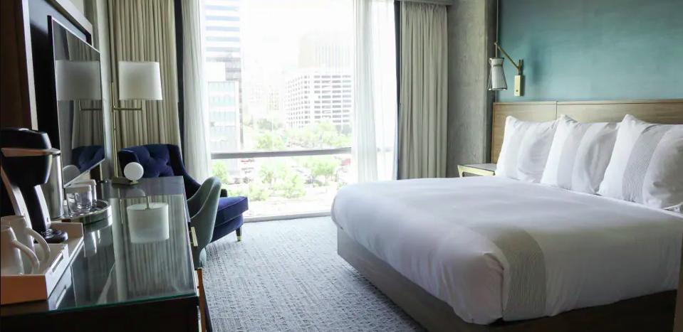
A room at the Carte
Haley Hill
Concrete pillars are another element in both the rooms and amenity spaces. This style reflects the design of the famous Scripps Pier, which was built from a mixture of concrete and wood from 1916-1980. Concrete also does double duty in the guest rooms because it blocks noise. Another notable feature is the wood tile flooring in the entryways and bathrooms. Wood tile has become incredibly trendy in recent years because it gives the illusion of wood but is more eco-friendly, sustainable and durable. Although contemporary in style, the light tan color of the tiling is reminiscent of the city’s beaches and boardwalks.
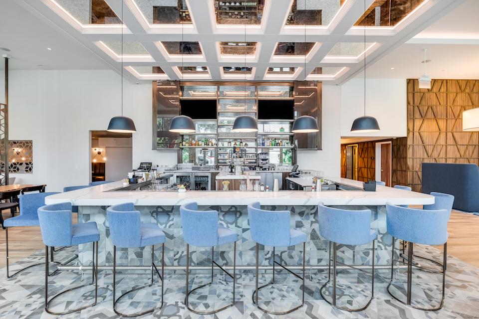
Eclectic design elements at the Carte.
Hayley Hill
The guest rooms also reflect the connection to the historic nautical roots of Little Italy’s residents with upscale and subtle nautical themes including a variety of blue and mixed metal accents. However, the sweeping view of downtown San Diego in each room provides truly jaw-dropping value.
The Guild Hotel
Just a few minutes away from The Carte, is The Guild Hotel, which is a Marriott Tribute property. It was designed by Sormeh Rienne, who came into the project when the building, which previously was a YMCA and a youth hostel, was already in demolition. So, she had to work extremely fast.
“I began by digging deep into the information already provided by the client, and studying San Diego’s landscape. Once I found my inspiration, I began developing mood boards, material palettes, and eventually more technical drawings and specifications,” she says.
The theme of the hotel is “5 o’clock somewhere in Europe.” So, Rienne sought to create a transporting experience as well as celebrate the building’s past. An example of this is the elevated running track in the event space, which was converted from a gymnasium.
On the other hand, the black and white striped furnishings in the center courtyard could also be used at a beach club in the South of France.
The rooms are also the epitome of charming with every single piece intentionally chosen and custom made. Sourcing pieces for a hotel can be a challenge for designers because they must withstand a great deal of wear and tear, but also maintain a particular aesthetic. From the pink velvet art deco style beds to the floor lamps and rose gold clothing hangers, there isn’t one choice Rienne made that wasn’t completely perfect.
The bathrooms, while not the most spacious, make use of every square inch. The classic white square tiles are surrounded by black grout, which she revealed was a choice that had to be justified to the hotel owners. Even the bathroom products, Replica Jazz Club by French perfumer Maison Margiela, which are normally an afterthought, feel like they belong in the hotel.
Lionfish
Lionfish is located in the Gas Lamp district at the Pendry hotel. This urban southern California seafood restaurant is stylish, cool and most importantly delicious. While executive Chef JoJo Ruiz calls it “a great space for nightlife and the late-night crowd,” it has a style and food any crowd will appreciate.
“We wanted it to have a hip modern design but still pay tribute to the playfulness of San Diego. Where convention diners, local surfers, and downtown residents can all feel comfortable dining in an approachable but highly detailed space,” says the owner of Clique Hospitality Andy Masi.
The restaurant was part of the hotel’s ground-up construction and opened in February 2016. While it does have a cool “nightclub” vibe, it’s stunning without trying too hard. With two levels, the height of the ceiling opens up the space. The wood, copper and brass elements come together to make it feel warm and welcoming.
But if you ask Ruiz, his favorite design element is the window into the kitchen. “That’s what all chefs love. I love that we are only steps away from our diners and that if we have friends or guests that want to visit they can pop their heads in.”
Serea
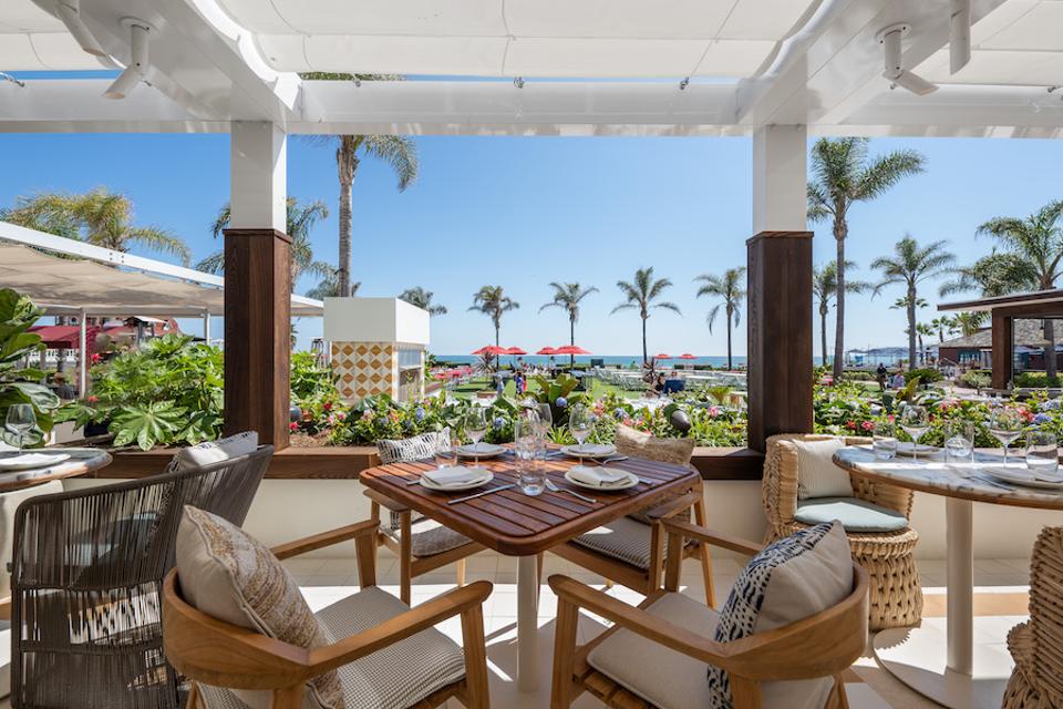
Located in the historic landmark Hotel del Coronado, there is no place else in the world like Serea, which has the same team and executive chef as Lionfish. Less than a year old, the challenge of designing the restaurant was trying to compete with nature, which is impossible. Beachfront views win every time. So Clique and Ruiz found the perfect way to compliment the view and enhance the dining experience.
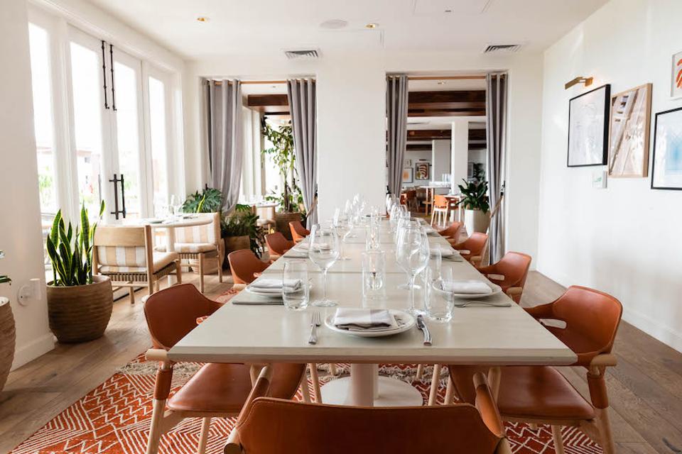
Serea interior.
Clique Hospitality
“When we sat down to start designing the restaurant, there were a few main key points we wanted to keep in mind. We began with wanting to create a space that was contemporary but would not clash with the old-world charm of the hotel Del, as if Serea was meant to be there since day one,” says Masi.
Serea exterior.
Clique Hospitality
The team focused on choosing the right furniture, adding local art and warming up the space with area rugs. Every element feels like someone’s home as opposed to typical commercially designed products. For example, the wood chairs feature pillows and pads in a variety of patterns to avoid that overly matched look that feels commercial and sterile. The plates and platter are made from both wood and ceramic, while complimenting marble tabletops. The charm of Serea is that it feels like a mansion, not a restaurant.
Saffron & Sage
Southern California is the wellness capital of the world. So, it’s not a surprise that Saffron & Sage, which is a holistic health club offering spa treatments, yoga classes as well as other various physical, psychological and spiritual therapies has become a hot spot.
A relaxing treatment room at Saffron & Sage.
Saffron & Sage
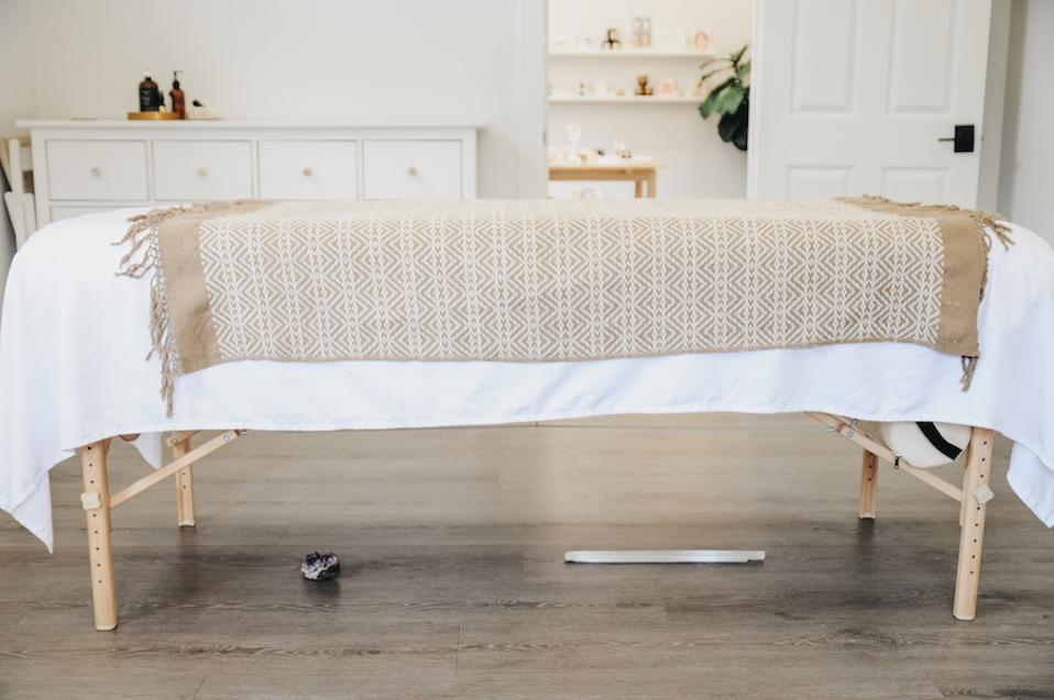
The minimalist décor of the space was chosen to remove outside stimulation and bring clients into the present moment. “With a neutral environment around us, we can cultivate our awareness inward on our interior landscape,” says Cristin Smith, who is the owner.
Flooded with sunlight, while most similar spaces are dark, the interior is all about aspects of nature, although it’s located on an industrial city street. The massage rooms are generously sized with large windows, making treatments feel entirely different than most day spas. But there is a deeper reasoning behind this, Smith explains. “We use light to clear and remove blockages and barriers. Natural light is a symbol of that technique as well as an instrument that supports each treatment or therapy. Metaphorically the light-filled rooms invite our clients to bring their problems and symptoms into the light and release them.”
Saffron & Safe is a place to combine body, mind, and spirit. “We want to cultivate an honesty with ourselves learning to hold space for the pain, loss and disappointment we experience in life and then internalize, which then becomes stored in our body and often contributes to disease and illness,” she says.
Positive energy is felt throughout each room because of the strategically placed crystals. Black tourmaline in the corners as well as under the practitioner’s chairs absorb and cleanse negative energy. Amethyst is placed under the head cradle of each massage bed to support the crown chakra and connect to the divine. All of this adds a level of spirituality, creating an elevated experience.
Swirl Boutique
Located in the sleepy seaside town of Carlsbad, the design of Swirl boutique is just as chic as their merchandise. It’s not about shopping so much as exploring fashion and connecting to one’s personal sense of style. While Swirl is a local business, it’s also a hot spot for reality stars including Amanda Stanton of The Bachelor who launched her fashion line, Lani The Label at the store. Emily Simpson from Real Housewives of Orange County is also a frequent shopper.
Swirl Boutique Carlsbad.
Natalie Imgraben
Owned by fashion stylist Lisa Landers, she puts her own touch on every aspect of the space, although she enlisted Susanna Samaniego and Elaina Samaniego-Myers of Design 4 Corners to bring her vision to life.
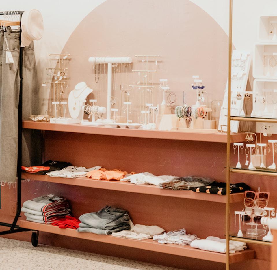
Color is one of the most important features of the space, explains Samaniego. “Lisa wanted color blocking and tone on tone happening with the colors. She told us this from the very beginning. We chose the colors we did, because they are feminine without being too young. It was important for us to create a color pallet that was still youthful, but also catered to a high price point. Blending the two was important. We wanted you to feel comfortable to walk in, and look around.”
Swirl dressing rooms.
Natalie Imgraben
The boutique is incredibly social media-friendly from the use of pink in shades from millennial to blush, to the neon sign and terrazzo floors. The natural lighting and large frontage also make it ideal for photos.

Chic times at Swirl.
Natalie Imgraben
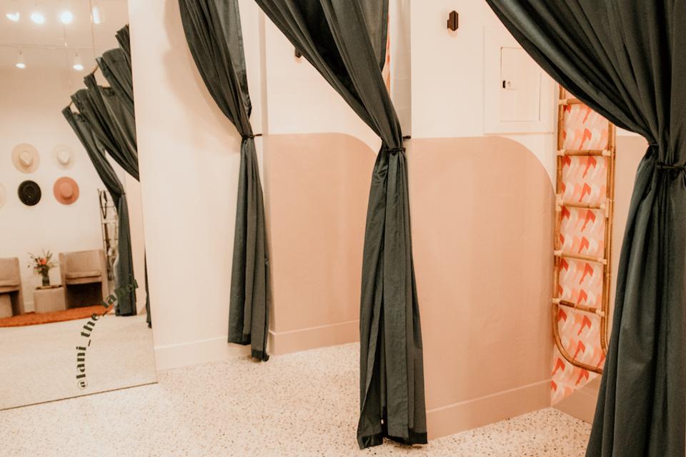
One of the best parts of Swirl is the dressing room, which Samaniego describes as a style lounge. “We created a runway where you are surrounded by mirrors and plush velvet. Everything a gal needs to feel special.” The fact that there’s also comfortable seating for friends and partners doesn’t hurt either.
Despite all of these features, the space looks entirely effortless. And what could be more California than that?

