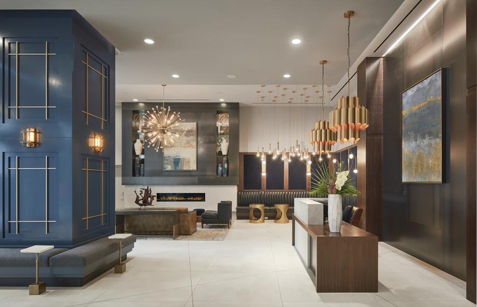
Mid-century modern-designed lobby of The Paragon, a new residential build in Chicago.
Courtesy of Taylor Johnson
Chicago, Ill. – Mary Cook Associates (MCA), a national, award-winning commercial interior design firm, recently completed The Paragon (1326 S. Michigan Avenue), Murphy Development Group and CIM’s new 500-unit luxury rental build in Chicago’s South Loop neighborhood.
Cook and her team approached the design of The Paragon’s public spaces and select model units with a “mid-century-meets-Manhattan aesthetic.” Cook explained that “the architectural facets of the building inspired many of the details visible in the lobby…The building’s exterior angles are captured in the lobby’s feature wall and flooring, while the tower’s mirror-like façade ties into the metallic accents that are featured throughout the lobby.”
“Mid-century modern design is the antithesis of fussy.”
Cook included tenets of mid-century style in her decor choices as well, such as clean lines, natural wood finishes, intentional use of metallics, and elegantly curved pieces to add character and dimension.
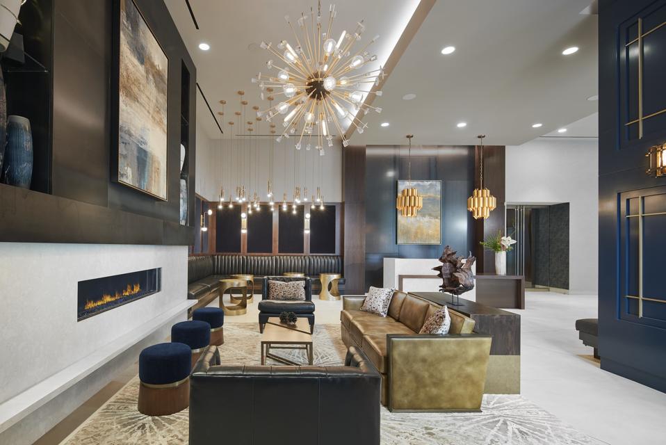
“The hallmarks of mid-century modern design include simple, curved contours in both furniture and … [+]
Courtesy of Taylor Johnson
We recently sat down with Mary Cook to learn more about her love of the mid-century modern aesthetic and to find out why it remains so popular in both commercial and residential design.
Can you talk about the enduring appeal of the mid-century modern aesthetic?
MC: The mid-century modern design aesthetic is considered one of the classics. Popular from the 1930s through the 1960s, it has timeless appeal and is instantly recognizable with its contemporary – almost futuristic – characteristics. It is minimalistic yet highly functional. Most people associate the style with the popular TV drama, Mad Men. During the eight years the show was on TV, the style experienced a huge boon. The show portrayed a wide variety of styles popular in the era, but generally, furnishings produced then offered clean lines and were well-made, sophisticated, functional and inclusive of many influences. Mad Men definitely inspired the interest of the masses (including clothing and furniture collections) but the style, like many of the classics, has been a staple of interior design for decades.
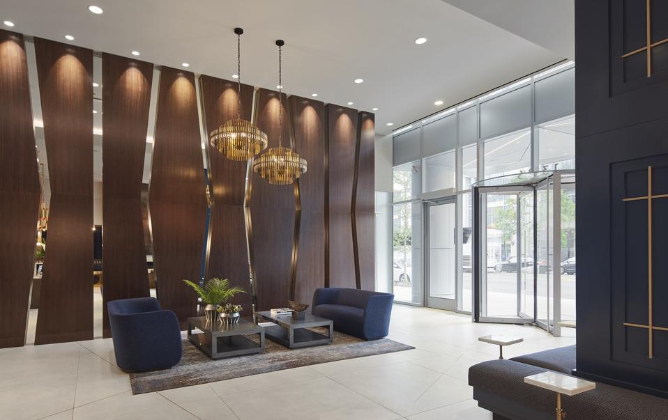
A wall of deep mahogany wood with mirrored cut-outs flanks the lobby interior, reminiscent of the … [+]
Courtesy of Taylor Johnson
What do you consider to be the hallmarks of MCM design?
MC: The hallmarks of mid-century modern design include simple, curved contours in both furniture and accessories, while incorporating large expansive windows that bring nature in. Flat planes enhance the bright colors, natural textures and walnut wood tones are common to the style. Fabrics should be primarily solid or with minimal, geometric pattern, if any at all. Furniture, accessories, and detailing should be in modern materials, such as plywood, glass, metal, vinyl, plexiglass, and plastic, with little ornamentation resulting in an overall minimalistic look with clean lines.
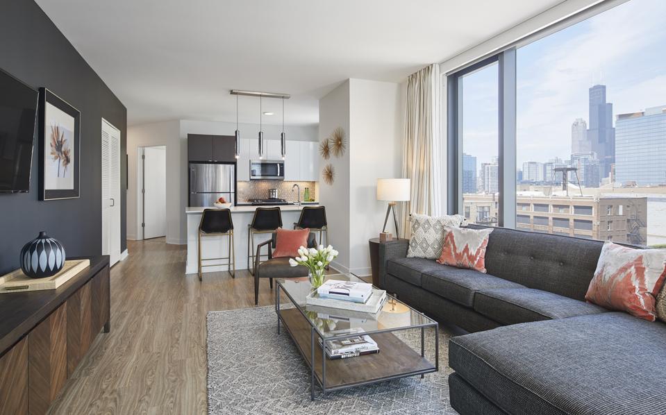
Mary Cook Associates designed select model units in The Paragon using a mid-century modern … [+]
Courtesy of Taylor Johnson
How do you balance the MCM aesthetic with a modern build and modern amenities?
MC: Very easily. The mid-century modern aesthetic complements the popular modern buildings and homes of today very well. While the scale and proportion of buildings and spaces may be larger than in the past, you can create great balance by using classic mid-century furniture and furnishings, especially with proper background designs. I guess that is what makes it a classic!
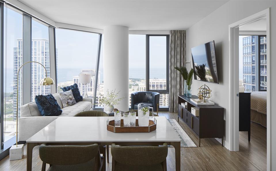
Model unit designed by Mary Cook Associates. According to Mary Cook, “mid-century modern design is … [+]
Courtesy of Taylor Johnson
Aside from the enduring popularity of MCM, what are other design aesthetics to watch?
MC: Contemporary has definitely taken center stage since the last great recession. Driven by a socially-conscious generation, there is great appreciation for authenticity –that includes all things handmade and natural materials. You can see this through the popularity of Etsy, which tapped into a generation of “makers” and saw its registered sellers climb from 450,000 in 2007 to 54 million in 2015.
