In Panorama City, there is a condo complex near the intersection of Van Nuys Boulevard and Nordhoff Street that you won’t ever find featured on fancy architecture websites. The development’s 18 units are clad in stucco and painted an unsympathetic shade of butterscotch. Each unit’s most prominent feature is the garage door. The aesthetics are somewhere on the continuum between homely and anonymous.
Yet I will argue that the design — by an architect whose name has long been lost to the planning department — is a prime example of density done intelligently and humanely. Each unit comes with a small enclosed patio for intimate family gatherings, while a shared lawn in the middle of the complex provides a green space and play area. Clusters of two-story units share walls and roofs, minimizing the architectural footprint and, therefore, sprawl. In addition, the development’s protected lanes are the perfect place for a kid to ride a bicycle away from speeding cars.
I should know: This is where I learned to ride my bike. My family lived in this plain Jane development back in the late ’70s. The complex, located just off of Wakefield Avenue, was completed in 1973.
Los Angeles might be known as a city of sprawl, but it’s also a place that can do density remarkably well — and has done so for more than a century. L.A. has been the site of thoughtfully designed garden apartments like Baldwin Hills’ Village Green, which is a National Historic Landmark, and, of course, there are the city’s signature bungalow courts, the workaday residences that inspired the literature of Charles Bukowski and avant-garde interpretations by architect Irving Gill. (See his Horatio West Court in Santa Monica, completed in 1919.)

A view of architect Irving Gill’s Horatio West Court in Santa Monica, completed in 1919.
(Carolina A. Miranda / Los Angeles Times)
The city is in the process of revising many of its community plans. We are also in the midst of an epic housing crisis and are, after a pandemic-induced respite from traffic, once again facing jammed freeways and their attendant smog.
This makes it a critical time in which to talk about how L.A. neighborhoods might be designed with increased density in mind — preferably in ways that steer clear of sky-is-falling scenarios about “Manhattanization” (absurd) or reactive panic to whatever density legislation State Sen. Scott Wiener might be working on in Sacramento.
Enter a well-timed design challenge organized by the office of L.A.’s chief design officer Christopher Hawthorne and Mayor Eric Garcetti’s Office of Budget and Innovation. Launched late last year, “Low Rise: Housing Ideas for Los Angeles” invited architects to imagine new, higher density options rooted in the architectural traditions of the region — such as the low-rise condo complex I grew up in, which has now been around for almost half a century and hasn’t Manhattanized anything.
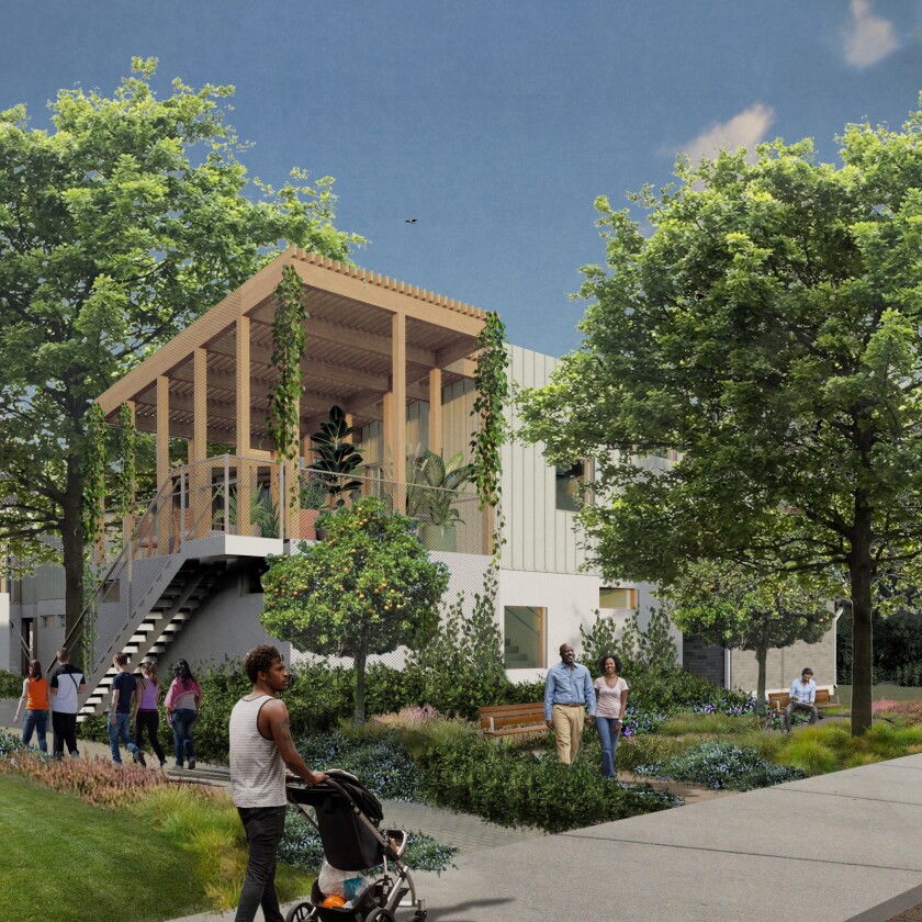
An architectural rendering shows details for a winning proposal for a fourplex by Omgivning and Studio-MLA that offers a mix of private and public outdoor areas.
(Omgivning / Studio-MLA)
On Monday morning the city is scheduled to announce the winners in the competition’s four categories, with each first-place winner receiving a $10,000 award. (Winners and plans will be posted to the website, lowrise.la.) The challenge is a conversation starter and design exercise. It’s also a needed counter to commercial real estate developers, whose ideas of density tend to be based on a single principle — how many dollars they can squeeze out of every square foot — with little regard for green space or other community needs. (Case in point: those sad, blocky duplexes and triplexes jammed into islands of tree-less concrete.)
The winning designs for the “Low Rise” design challenge, however, offer a density L.A. can aspire to.
A first-place proposal for a fourplex by the L.A.-based studio Omgivning, created in collaboration with the landscape firm Studio-MLA (led by Mia Lehrer), takes a 7,500-square-foot single family lot and imagines it as the site of several two-story housing units arranged around private and public outdoor areas. Another, by New York-based designer Vonn Weisenberger, uses a pair of adjacent corner lots to accommodate at least three comfortably scaled bungalows and a corner store — all in an architectural style inspired by Cliff May, the 20th century California designer who helped pioneer the ranch house.
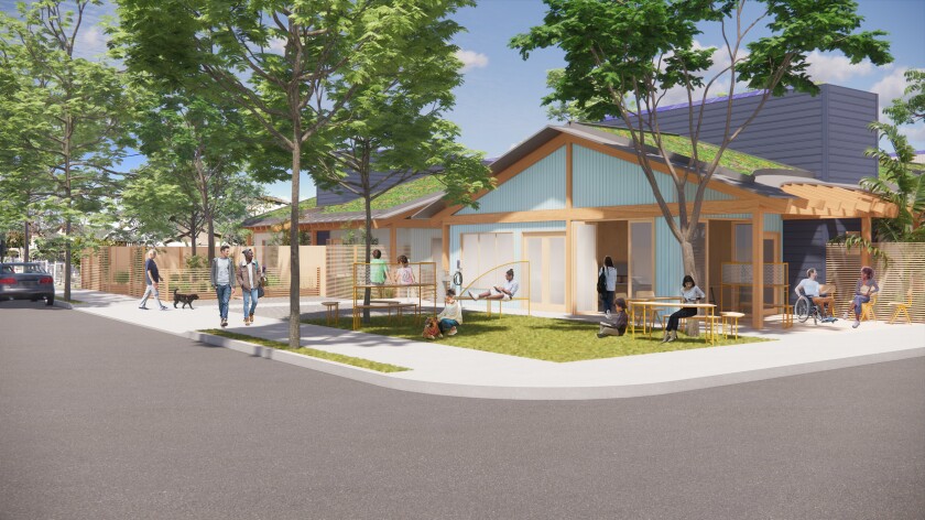
Vonn Weisenberger’s rendering features details from his winning design, which included a mix of housing and street-facing public space inspired by the designs of Cliff May.
(Vonn Weisenberger)
One of the competition’s prompts asked architects to submit a design for a standalone duplex on 2,500 square feet of space carved out of an existing single-family lot. One of the more imaginative proposals came from Louisa Van Leer, principal of Louisa Van Leer Architecture, who teamed up with urban planners Antonio Castillo and Garen Yolles along with a group of design students from Cal Poly Pomona to produce a concept that puts a row of duplexes along L.A.’s ubiquitous alleyways, turning them into intimate, inhabited lanes.
The proposal was inspired by a 2014 study published by the Trust for Public Land and UCLA’s Luskin Center for Innovation that showed L.A. is home to approximately 900 linear miles of alleys — an area about twice the size of New York’s Central Park. Yet they are often neglected and therefore frequently the site of nuisance crimes such as graffiti and dumping.
“If there are no eyeballs on a street, no one will care about it,” says Van Leer. “But as soon as you put front doors, it’s a place that has been invested in, people start to value it.”
The proposal — which took first place in its category — is inspired by a movement to transform urban alleys into “green alleys.” This includes turning them into amenities like pocket parks and community plazas, or environmental redesigns that allow these sites to capture rainwater or break the heat island effect. Already, alleys around L.A. have been remade in this fashion. In Hollywood, an alley off of Cahuenga Boulevard was turned into a nightlife strip in 2012, while in Sun Valley, planners transformed a sunbaked passageway off of Elmer Avenue into an attractive linear park.
Van Leer and her collaborators layered onto those existing ideas. “I’m not inventing,” she says. “This has already been through the grist mill of planning and sanitation. I’m building on that scaffold and adding housing to it.”
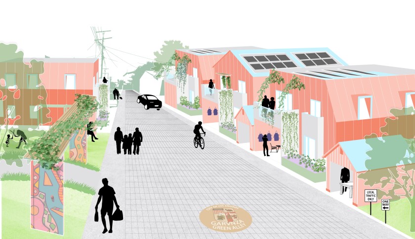
The Green Alley Housing proposal would bring low-rise density and environmentally-minded design to L.A.’s ubiquitous alleys.
(Louisa Van Leer Architecture)
If the ideas seem very practical, it’s because they were intended to be.
“Low Rise” was not a platform for paper architects to disseminate some top-down utopian vision for a house of the future. Instead, the challenge began with a series of engagement sessions with community leaders and housing advocates about how they saw their neighborhoods evolving and what they would like to protect. The sessions were required viewing for any architect who wished to submit a proposal. (A total of 380 were received.)
The idea was to generate concepts that might actually stand a chance of getting approved and built — or at least serve as a functional basis for future designs.
“There’s a pervasive narrative about housing policy that sees it as deeply polarized,” says Hawthorne (who previously served as The Times’ architecture critic). “We’ve found in our community engagement that most people are somewhere in the middle. They realize that our land-use approach isn’t sustainable for the 21st century. The pressures of climate change and new scholarship about redlining and other racially restrictive housing policies have really clarified that for a lot of people.
“At the same time, they have reasonable concerns about what any changes to that approach will mean in their own neighborhoods. And those concerns are especially acute in communities of color, where changes to zoning and land-use policy have, historically, often come at their expense.
“The design challenge,” he adds, “was structured to meet people where they are.”
Moreover, it was an opportunity to think about housing in a way that doesn’t necessarily involve razing entire city blocks.
L.A.’s Transit Oriented Communities program, for example, has helped incentivize the construction of large-scale multifamily dwellings with affordable housing units in sites near public transit. But the purpose of the “Low Rise” challenge was to study concepts that could be more easily tucked into the in-between spaces.
In other words: density, L.A.-style.
“That in-between territory,” says Hawthorne, “makes up more than 80% of the residential land in Los Angeles.”
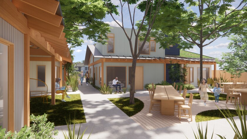
An architectural rendering shows Vonn Weisenberger’s “Low Rise LA” proposal, which features a shared courtyard space. The designs were inspired by ranch house pioneer Cliff May.
(Vonn Weisenberger)
The designs submitted respond to a range of concerns. Among the most prominent: environment.
Weisenberger’s proposal — the one with three bungalows and a commercial space — carefully mapped all of the existing trees on site and designed around them. In addition, his residential units bear green roofs planted with the hardy succulents and flexibly designed areas that can be used for the storage of water or solar energy.
Likewise, the plan submitted by Omgivning and Studio-MLA, titled “Hidden Gardens,” is a careful study in how the proposed site would respond to environmental conditions. In addition, the designers supplied a range of ways in which occupants could access fresh air and the outdoors: downstairs sleeping areas open onto small private gardens, while upstairs common spaces connect with large outdoor decks.
On the street-facing side, the designers set the buildings back from the property line, to allow for additional outdoor space. If several of these fourplexes were to be built contiguously along a single block, these open areas could come together to form a community garden or a pocket park.
The pandemic has made it evident that access to the outdoors isn’t a luxury but a necessity. “Hidden Gardens” takes that idea and makes it graceful and humane.

A rendering shows one of the private terrace areas in the residential proposal by Omgivning, created in collaboration with landscape firm Studio-MLA.
(Omgivning / Studio-MLA)
The focus on practicality doesn’t mean that the competition doesn’t have some architectural flourish. One of the more imaginative categories was “(Re)Distribution,” in which designers were asked to come up with ideas for carving up an existing landmark house in Los Angeles into several units.
Arts and Creatives Designs Ltd., a studio based outside of London, came up with the winning proposal, which reimagined the early Modern Rudolph Schindler House in West Hollywood, completed in 1922. Their proposal converts the historic home into four apartments — two of which would share a kitchen; one of which would be entirely separate from the rest of the house. (A nod to the realities of COVID-19, in which isolation may be a necessity.)
From the outside, the Schindler House’s profile looks virtually unchanged. It’s on the inside where the architects got to work, designing modules that could be nestled within the existing building to create warm bedrooms and study areas. (The Schindler House is famously drafty.) Additional modules were added to porch areas, including the sleeping porches on the roof, in order to expand the home’s living space.

A drawing by Arts and Creatives Designs Ltd. shows a module tucked into the architecture of the Schindler House in West Hollywood.
(Arts and Creatives Designs Ltd.)
The idea was to preserve the integrity of Schindler’s building while employing as few other materials as possible. “One of the things that we were keen on was sustainability,” says Arts and Creatives founder Sonda Mvula. “We didn’t want to knock down any buildings. It costs more to knock a building down than build it.”
The architects included other environmental touches: the addition of a green roof and wetlands to filter wastewater. “We wanted to incorporate nature into the building a bit more,” says Verity Roweth, who worked on the project with Mvula, along with fellow designers Chandni Rakhra, Sameera S. Rauf and Lola Tartakover.
The proposal may seem fanciful, but it provides an interesting model for transforming large structures into smaller, more habitable ones — without the need for expensive materials, a long period of construction or displacement.
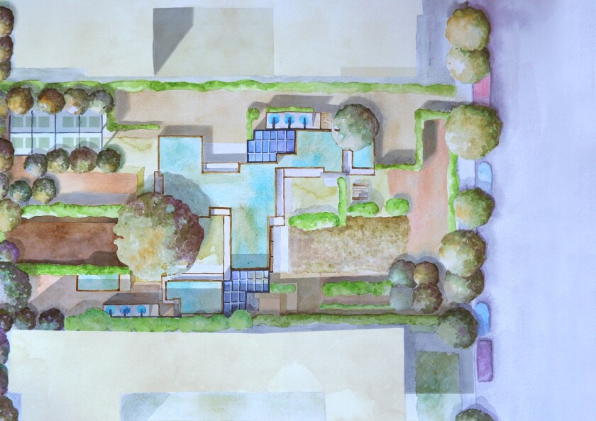
A watercolor by Arts and Creatives Ltd. shows the landscape plan for the Schindler House.
(Arts and Creatives Ltd.)
Mostly, however, the visions of the future offered by the “Low Rise” challenge are highly accessible.
They are visions of L.A. that are attuned to sprawl and the need for green space. To some degree, it’s not that different from the city I inhabited in the 1970s. We’ve been doing density all along. Now we simply need to do it better.
